Eight rounds of review: polishing the dbx-migrator console with three models
Three models scored the dbx-migrator console from Storybook screenshots. We fixed what they agreed on and asked again, eight times. The score went from 5.7 to 7.3, short of the 8.7 goal, and the last rounds showed why: past 8 needs a design-system pass, not another review.
The dbx-migrator console (ui/, Angular and Storybook) worked, but it looked like a first draft. Titles were very
large, panels had no padding and the flow matrix ran off the page. Every state had its own kind of chip. We wanted a
quick, honest way to improve it without guessing what “better” means. So we asked three models to score the console as
reviewers, fixed what they agreed on and asked them again. We did eight rounds.
This post shows the console before and after, what each round changed, and where it stopped.
The method
- Screens from Storybook, not from a live app. Every component and page state already has a story, with fake data
from
ui/src/stories/fixtures.ts. A small Playwright script builds Storybook and takes a screenshot of every story: 1440 px wide for desktop and 390 px for theNarrowstories. That gives 165 screens per round. They are the same every time, contain no customer data and need no backend. - Three reviewers, one brief. Claude (Opus 5.5), Codex (GPT-6.1) and Grok (4.7) each got the same brief and the same folder of screens. Each scored seven categories from 1.0 to 10.0: Typography, Hierarchy, Spacing & Density, Color & Contrast, Iconography, Consistency & Polish and Clarity, plus Overall. Each wrote JSON with the scores, a short rationale and a ranked list of improvements, each with a where, a what and a why. The brief said to score against a console you would ship to customers, not against the last round, so an improvement alone does not earn points.
- Fix what they agree on. We grouped the improvements across the three lists. Anything two or three reviewers raised was fixed first. A point raised by only one reviewer was fixed if it was cheap or clearly right.
- Every fix passes the gate.
make ui-checkchecks the generated API client and builds the app. It runs the unit specs, checks that English and Dutch have the same keys, and runs every story as a test with axe for accessibility. Nothing went to the next round unless that gate passed.
The scores
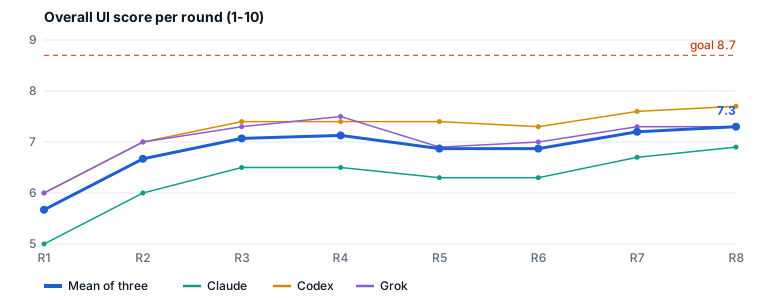
| Round | Typo | Hier | Spacing | Color | Icons | Polish | Clarity | Overall |
|---|---|---|---|---|---|---|---|---|
| 1 | 6.0 | 5.7 | 5.0 | 6.3 | 7.0 | 5.7 | 6.0 | 5.7 |
| 2 | 6.7 | 6.3 | 6.0 | 6.7 | 6.7 | 6.3 | 6.3 | 6.7 |
| 3 | 7.2 | 7.1 | 6.5 | 7.3 | 7.2 | 6.9 | 6.9 | 7.1 |
| 4 | 7.4 | 7.2 | 6.7 | 7.4 | 7.2 | 7.0 | 7.1 | 7.1 |
| 5 | 7.2 | 7.1 | 6.3 | 7.4 | 7.1 | 6.7 | 6.9 | 6.9 |
| 6 | 7.2 | 7.0 | 6.5 | 7.4 | 7.2 | 6.7 | 6.8 | 6.9 |
| 7 | 7.5 | 7.2 | 6.9 | 7.6 | 7.3 | 7.2 | 7.2 | 7.2 |
| 8 | 7.5 | 7.3 | 7.1 | 7.6 | 7.2 | 7.2 | 7.2 | 7.3 |
These are means of the three reviewers. Rounds 1 and 2 were scored in whole numbers, and one decimal from round 3 on. Claude was the strictest every round (6.9 in round 8). Codex was the most generous (7.7) and Grok sat in the middle (7.3).
Before and after
Plan
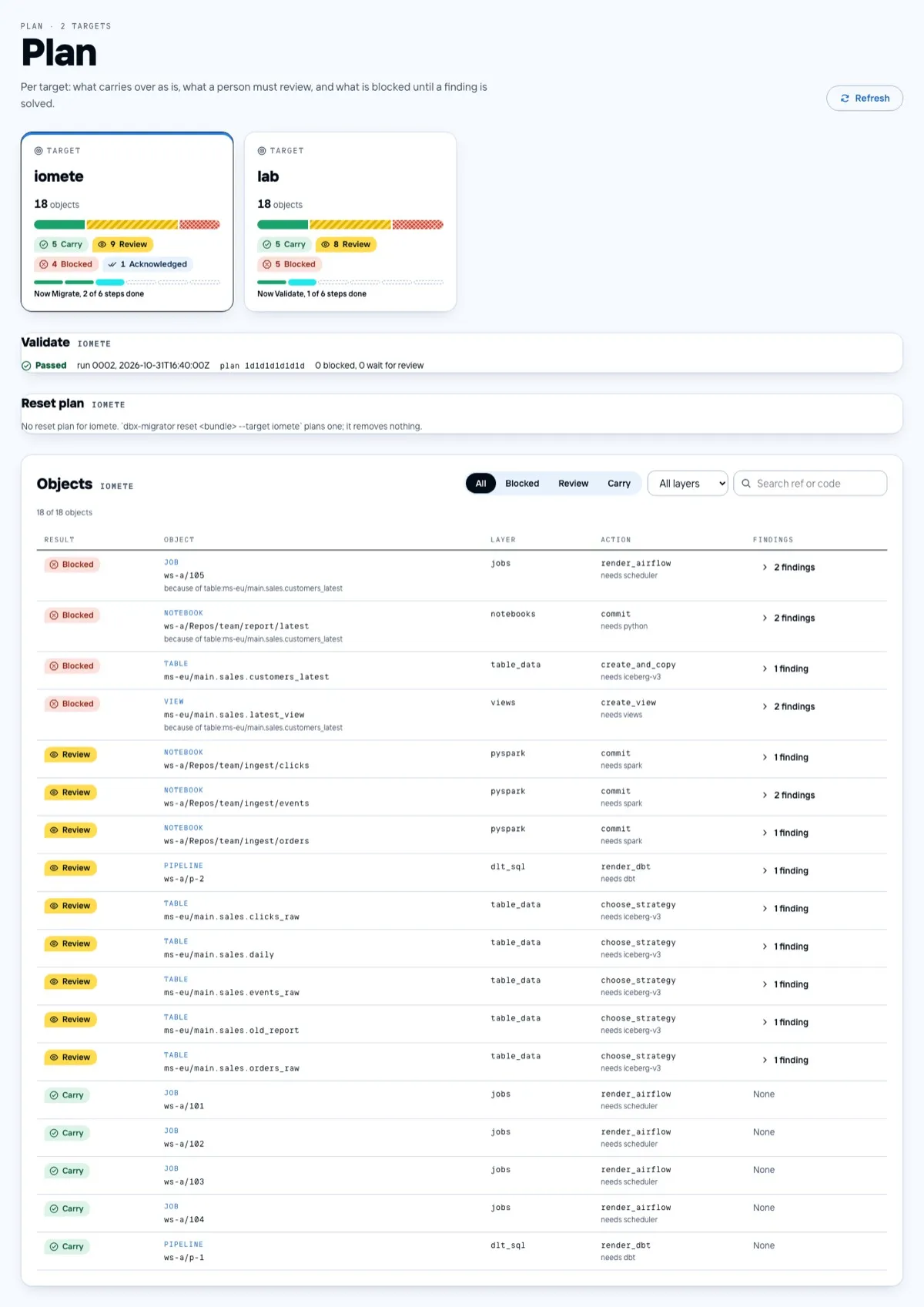
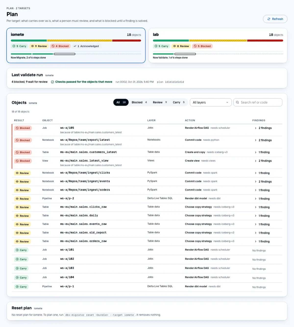
- The title is at an operational size instead of a poster size, and every small line above a title uses the same sans style.
- Target cards span the width. The progress rail is a single line, with the current step drawn as a ring.
- The validate line leads with what is still open (“4 blocked, 9 wait for review”). The run and digest come after it, in grey.
- Object kinds, layers and actions read as words (“Render Airflow DAG”, “Table data”), not as identifiers. The raw value stays in the tooltip.
- Blocked rows keep the red label and a thin red bar, but lost the red background. The row says “blocked” twice, not four times.
- The filter shows a count per result.
Runs and the flow matrix
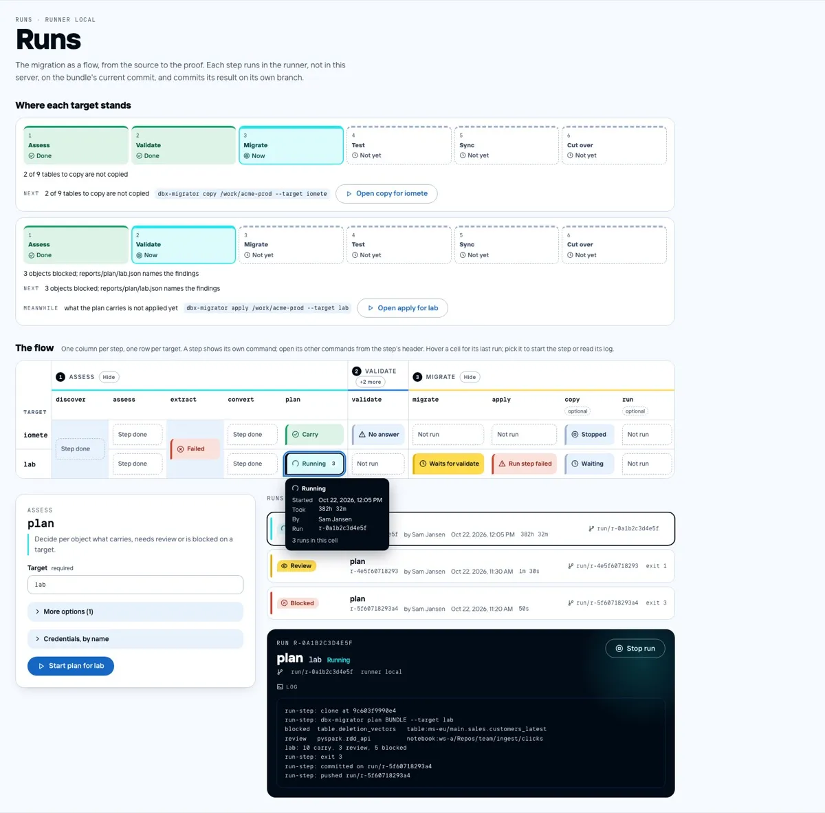
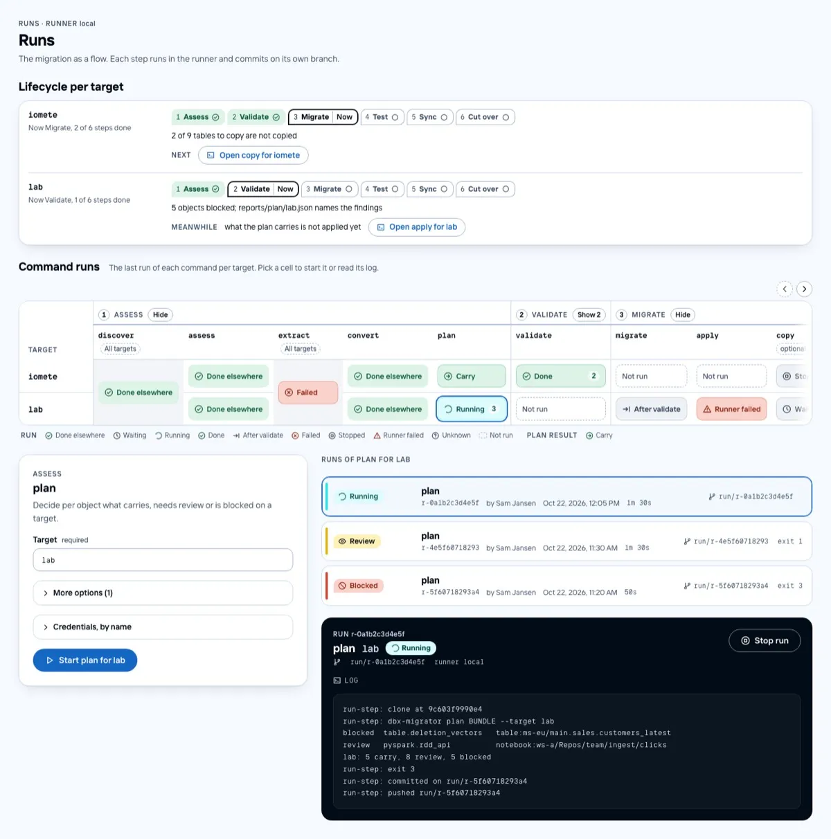
- “Where each target stands” was six large boxes per target. It is now a single line of step chips, with the reason and the next action under it.
- The command matrix scrolls inside its card and never widens the page. It has a scroll bar with arrows that show when there is more to the left or right. Each step snaps to the left edge.
- Run cells share one shape and use three looks: an outline, a dashed box for “not run”, and a fill for a result. The selected cell has a ring.
- The legend is built from the cells on screen. It is split into “Run” and “Plan result”, and each entry has a tooltip.
- The run list and log are lighter. The run state on the dark console uses its own colour, and step titles use the same sans heading as the rest of the console.
Operate
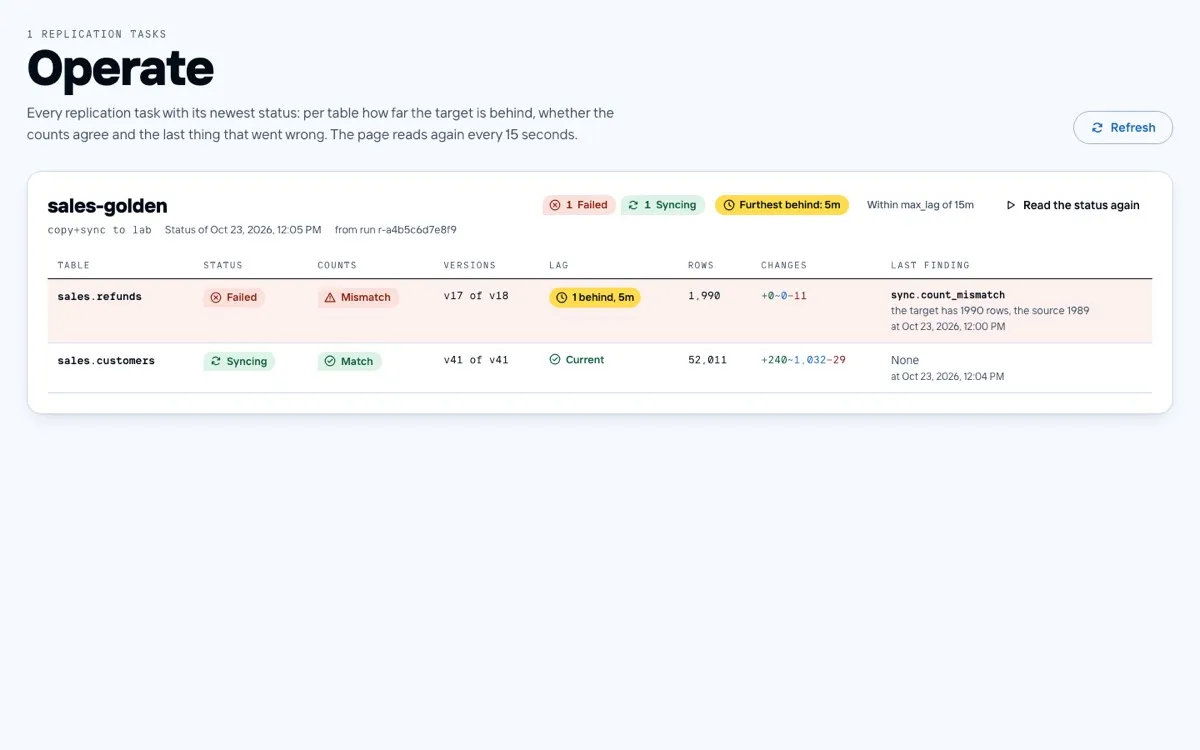
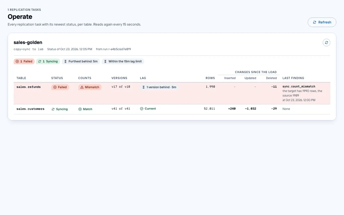
- Inserts, updates and deletes each have their own column. A zero shows as a dash, so the changes that did happen stand out.
- A table that is further behind than the task’s lag limit is red, like a failure. A lag within the limit stays grey.
- Each status uses one chip style, with an icon that means only that status. Lag has an hourglass, a count check has an equals sign.
Inventory
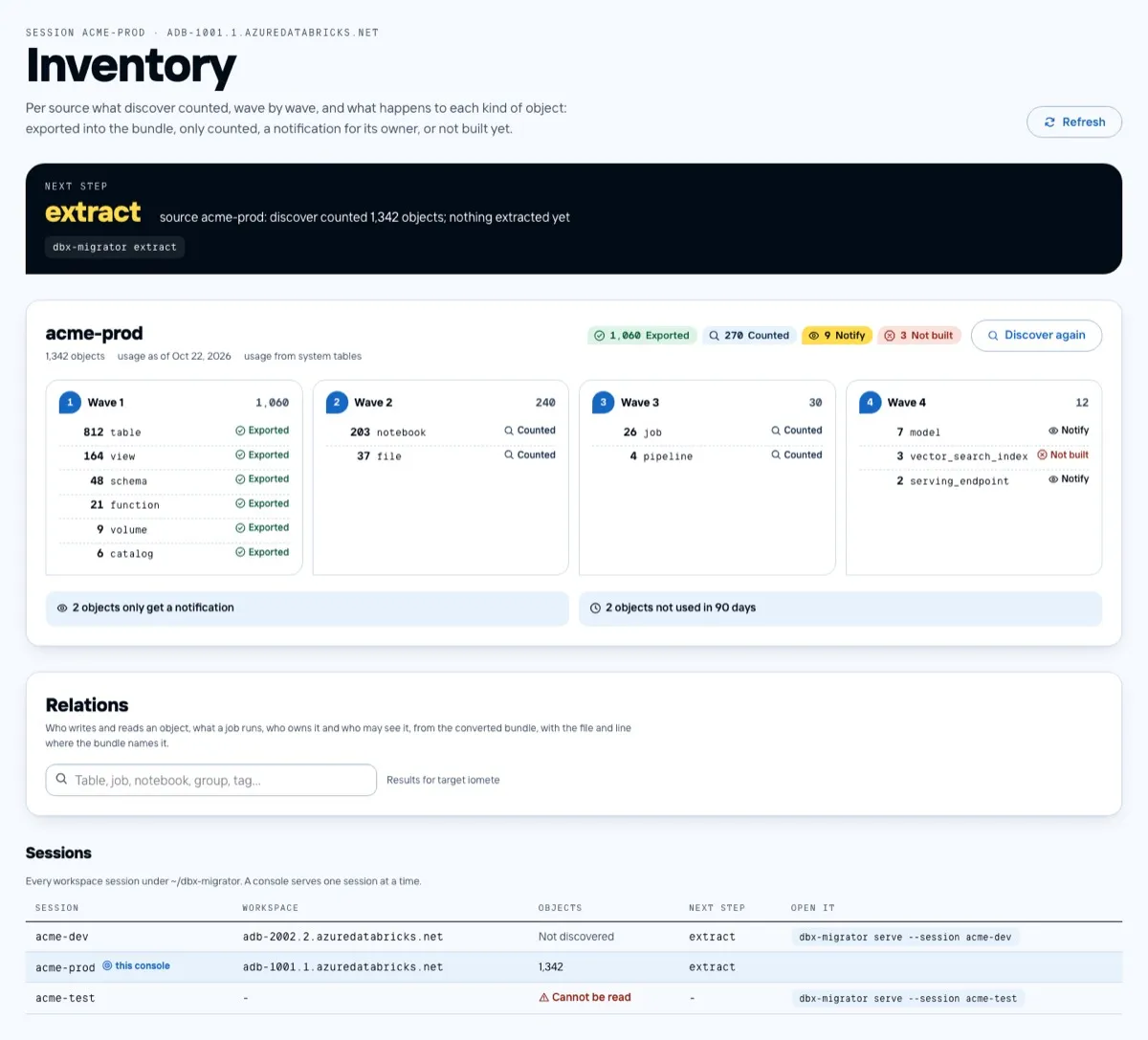
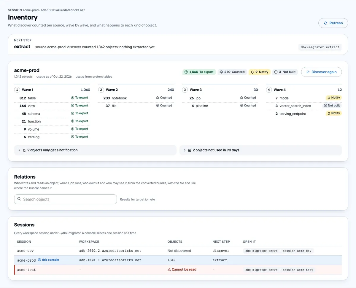
- The guidance names the session you are looking at and agrees with its state. The “next step” panel is calmer.
- A session whose discover failed gets the same light red wash and bar as a failed row in Operate.
- The empty state has a button that opens discover.
Errors
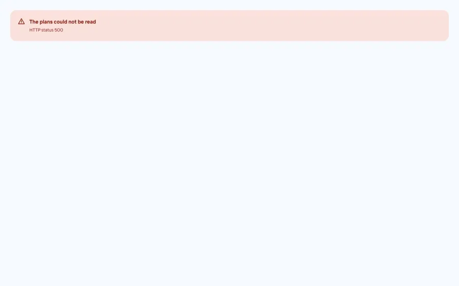
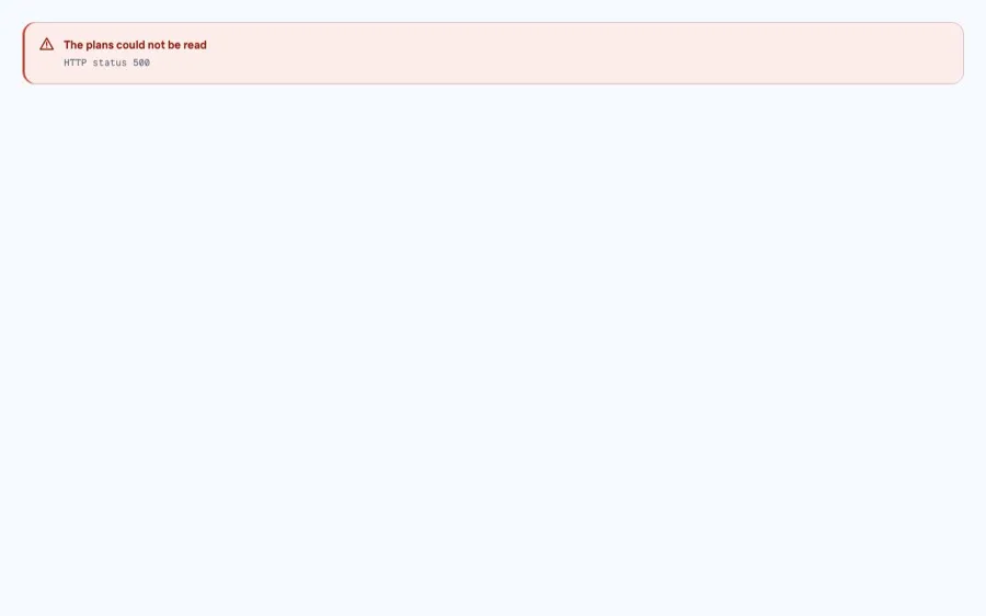
Loading, empty and error states share one component. The error panel is lighter now: a light wash with a red bar, a red title and the technical detail in grey mono.
Phones
Before round 7 there was no phone layout: pages became wider than the screen. Now every page works at 390 px. Tables turn into cards with a label above each value, the page refresh is an icon beside the title, and the Operate cards are laid out two by two.


What each round did
Round 1 (5.7): the obvious. All three reviewers asked for padding on the Validate and Reset panels, a smaller page title, and a flow matrix that stays inside the page. They also asked to make Blocked louder than Review, to split the change counts, and to put the target name on every rail. We fixed all of these.
Round 2 (6.7): one system. The reviewers now wanted a type scale in the design tokens, used everywhere. They asked
for one table header style and for signal colour spent only on what needs attention. We added the scale and the tone
variables (tone.ts) and replaced one-off sizes and colours with them. Two reviewers also found numbers that
contradicted each other between stories, such as a count in one panel that another panel did not match. Making the fake
data agree turned out to be design work too: reviewers read it as a product bug.
Round 3 (7.1): states that look alike. Selected, focused and running looked the same, so each got its own look: a ring, a focus outline and a spinner. The “next step” panel was calmed down. Table rows got tighter. Rail reasons were translated, and graph nodes got an ink stroke.
Round 4 (7.1): details. The matrix now opens scrolled to the start and no longer clips cells. Focus rings stay out of static screenshots. Blocked and Failed got different glyphs, and Acknowledged got its own fill instead of the Info colour. The score barely moved: the reviewers found new details as fast as we fixed old ones.
Round 5 (6.9): a step back. The score dropped. Changes from round 4 had made the lag chip overlap the row count. Identifiers were shown in upper case, and the Plan table lost some of its row lines. All three saw it. The lesson: a visible regression costs more than a round of small gains earns, so check the screens yourself before sending them to the reviewers.
Round 6 (6.9): phones. The reviewers moved on to small screens, where the Plan table and the Inventory sessions were clipped. The matrix also did not show that it scrolls. We built real phone layouts for every page and made matrix labels stay on one line.
Round 7 (7.2): the phone layouts land. These changes came in this round:
- tables as cards with labels on phones;
- one style for run cells;
- sans section titles;
- the current step drawn as a ring;
- a tooltip on every cell;
- plain words for run states (“Runner failed”, “After validate”, “Done elsewhere”).
All three reviewers still disliked the matrix arrows that sat over the headers, and the long legend.
Round 8 (7.3): one meaning per signal. These changes came in this round:
- the scroll bar above the matrix;
- the legend built from what is on screen;
- an icon of its own for carry, validated, exported, lag and spark;
- the lag limit shown in red;
- calmer blocked rows and a validate line that leads with the counts in Plan;
- the refresh icon beside the title on phones.
After round 8 (not scored). We added the last open points from round 7:
- a wash on the broken session row;
- a lighter run log;
- a lighter error panel;
- the clock icon only for “waiting”. “After validate” got its own arrow icon, and “Not run” and “To remove” got a hollow circle.
Where it stopped, and why
We set a goal of 8.7 and reached 7.3. In the last two rounds the score rose by about 0.1 per round. Each round still fixed what the reviewers asked for, but each fix also uncovered the next layer:
- columns cut in half at the edge of the matrix;
- matrix headers of uneven height;
- two pill sizes;
- mono and sans text not lining up in one table row.
Those are not spot fixes. To get past 8, the console needs a design-system pass:
- one size scale for pills and tags;
- an icon set with a single meaning per glyph, checked in one place;
- a matrix that only scrolls by whole columns;
- a clear order of information in every metadata line.
That is a few days of focused work, not another review round.
What we would do again
- Review the Storybook screens. They are cheap, the same every time and free of real data, and the reviewers see every state, including the error and empty ones a demo skips.
- Use several reviewers and act on what they agree on. A single model’s list mixes good points with preferences. Agreement between three different models was a good filter.
- Score on an absolute scale. Asking “how good is this as a product?” instead of “is it better than last time?” kept the numbers honest. It also showed when we had stopped making real progress.
- Keep the gate strict. Every story runs as an accessibility test, and English and Dutch must have the same keys. Over eight rounds of fast changes, that is what kept the console working.